Making AI Art That Doesn't Look Like AI Art
We've all developed an eye for it. That slightly too-smooth skin. The weirdly perfect lighting. The uncanny valley faces. AI art has a "look," and sometimes you want to avoid it. Here's how.
Why AI Art Looks "AI"
First, understand what creates that AI look. AI models were trained to maximize visual appeal and minimize artifacts. The result? Images that are technically perfect but emotionally flat. Too clean. Too polished. Too... optimized.
Real photography and art have imperfections. Grain. Slightly off compositions. Asymmetry. Natural lighting that isn't "perfect." These imperfections signal authenticity to our brains.
Add Texture and Grain
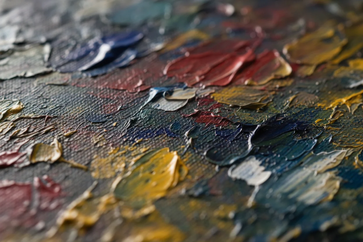
One of the fastest ways to make AI art feel more natural is adding texture references. Include terms like "film grain," "textured paper," "grainy photograph," or "canvas texture" in your prompts.
This breaks up that too-smooth AI finish. Even subtle texture makes images feel more tangible, more real.
Specify Imperfect Lighting
AI defaults to dramatic, perfect studio lighting because that's what gets trained as "good." But real scenes have ambient light, mixed sources, subtle shadows.
Try descriptions like "soft overcast light," "harsh midday sun," "single practical light source from window," or "natural indoor lighting without additional flash." Specific, imperfect lighting feels more authentic.
Embrace Asymmetry
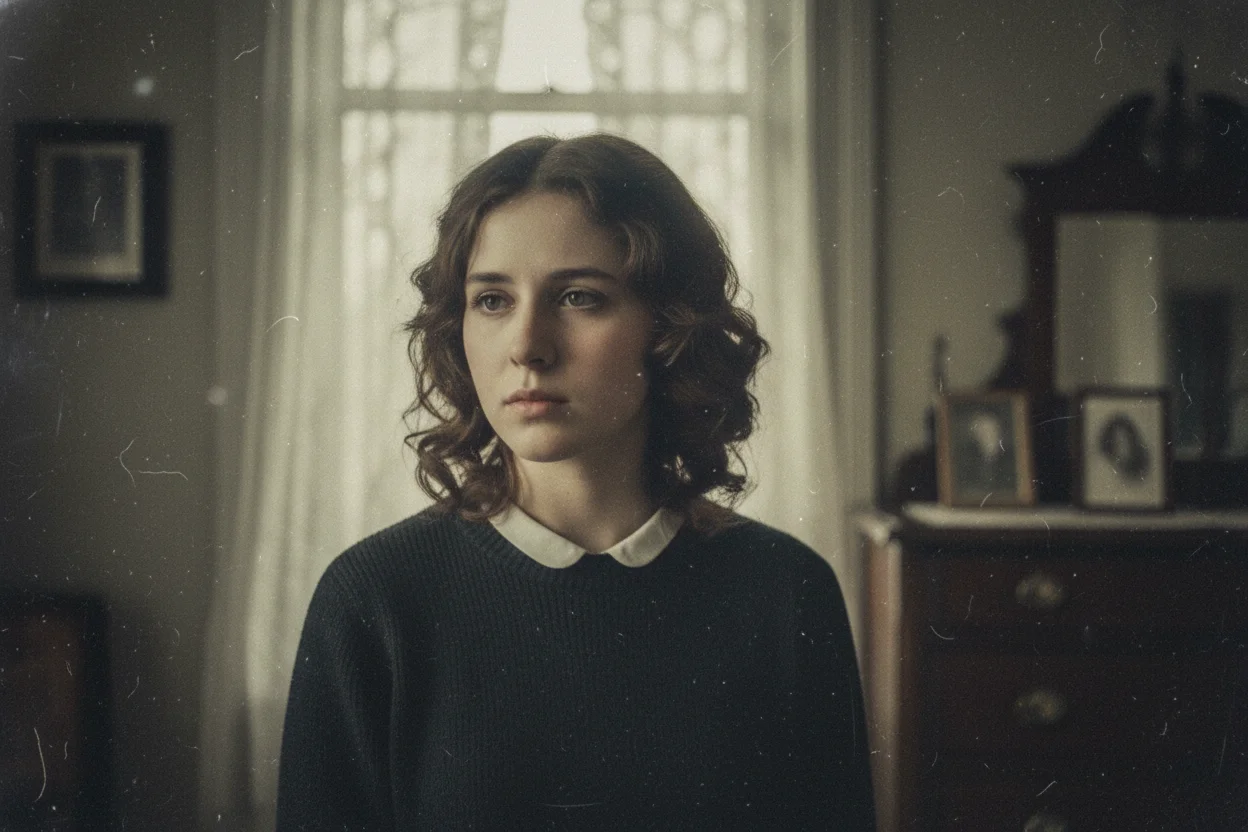
AI loves symmetry. Perfectly centered subjects, balanced compositions, mirror-like faces. Real life isn't symmetric.
Ask for off-center compositions. Describe scenes from unusual angles. Request "candid" rather than "posed" photographs. A subject looking slightly away from camera feels more natural than direct eye contact.
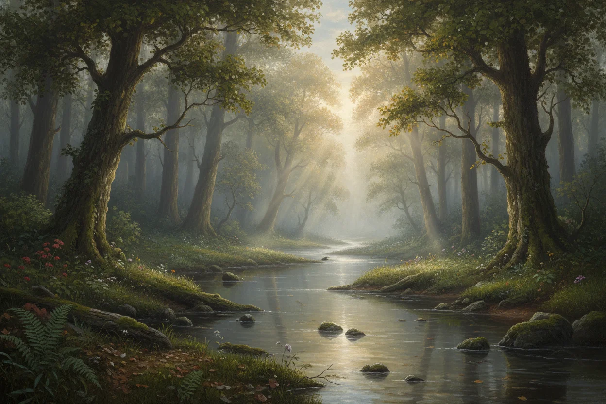
Reference Real Photography Styles
Instead of asking for "beautiful portrait," reference actual photographic styles with their inherent imperfections:
- •"35mm film photography" — Adds grain and slight color shifts
- •"Polaroid instant photo" — Faded edges, warm tones
- •"Disposable camera aesthetic" — Flash, red-eye, casual framing
- •"1970s magazine photography" — Era-specific color grading and composition
Avoid Trigger Words
Certain words push AI toward its over-polished defaults. "Stunning," "beautiful," "highly detailed," "8K," "masterpiece" — these all encourage the AI to maximize visual perfection at the cost of natural feel.
For more natural results, describe what you want without quality superlatives. Let the image quality come from specific, grounded descriptions rather than generic enhancement keywords.
Post-Processing Helps
Even with great prompts, a little post-processing can seal the deal. Adding noise/grain, slight color desaturation, vignetting, or minor blur can all help break that AI perfection.
Free tools like Phone apps or browser-based editors have filters that add these effects quickly. A 15-second edit can make AI art feel considerably more human.
The Bigger Picture
Not every AI image needs to hide its origins. There's nothing wrong with images that look like AI art — it's a legitimate aesthetic. But for those times you want something more natural, these techniques help bridge the gap.